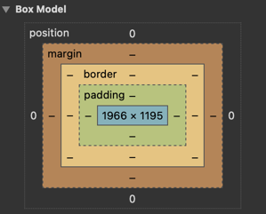
Box Model
Everything displayed by CSS is a box. Understanding how the CSS Box Model works is a core foundation of CSS.
We can see in the image below how all elements are boxes. Some of these boxes contain other elements, some are decorative, and some of them contain text and hold valuable information for the visitors.
As we have seen before, we could call everything just a box from a design perspective.
To understand them in a better fashion, each browser implements Box Model inside dev tools with some crucial information about our boxes that look something like this.
Box Model component
To make your life easier we have made a super component inside Oxygen Builder called the Box Model.
This component is composed of 6-in-1 panels so it could take just a fraction of your screen and provide all needed data.
There are three main panels:
- Space (Margin & Padding controls, and preview of computed element size)
- Border (Edit borders and border-radius)
- Size (Height, Width, and Overflow control)
Shortcuts (QWERTY):
Z - Space
X - Border
C - Size
V - collapse/expand panels
Supports:
✅ Auto PX to REM conversion
✅ CSS variables shorthands
✅ CSS functions
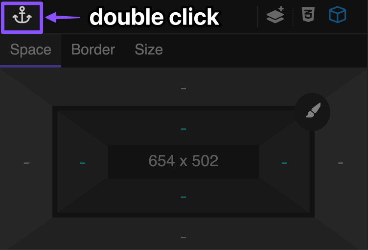
Freehand drag
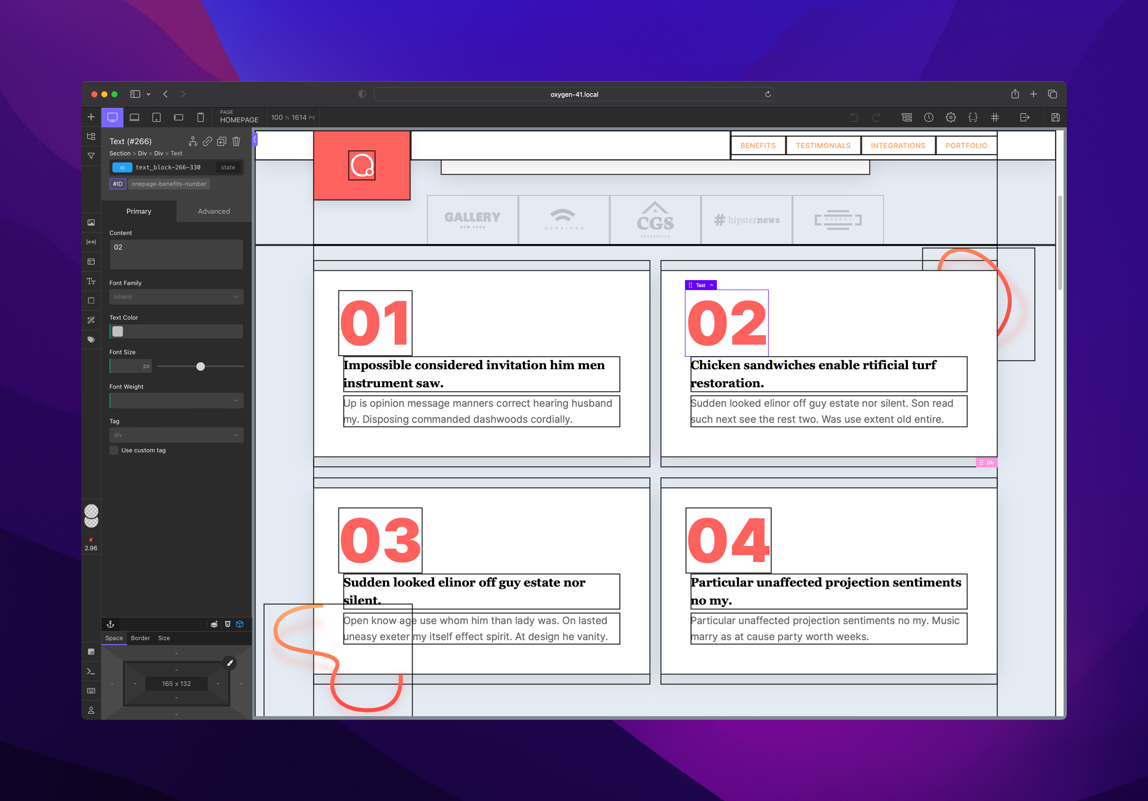
To undock the panel from the side panel and drag it around the editor, you will need double click on the anchor icon. And to dock again, repeat the same action.
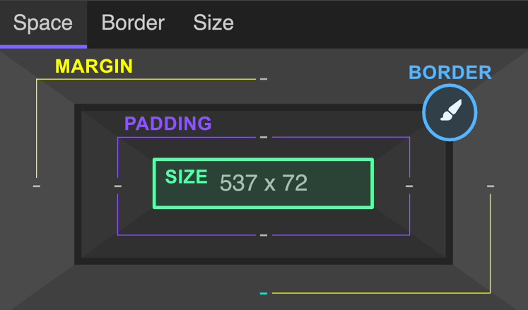
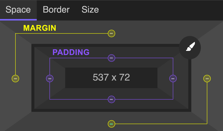
1. Space panel
In the image below space panel is shown. You could notice there are 8 spacing controls, four of them are for adjusting margin, and four of them are for adjusting padding.
In the middle of the panel you could notice computed size preview.
1.1 Adjusting Values
When you click on some of these options, popup panel with adjustment options will be shown and look like this in the picture below:
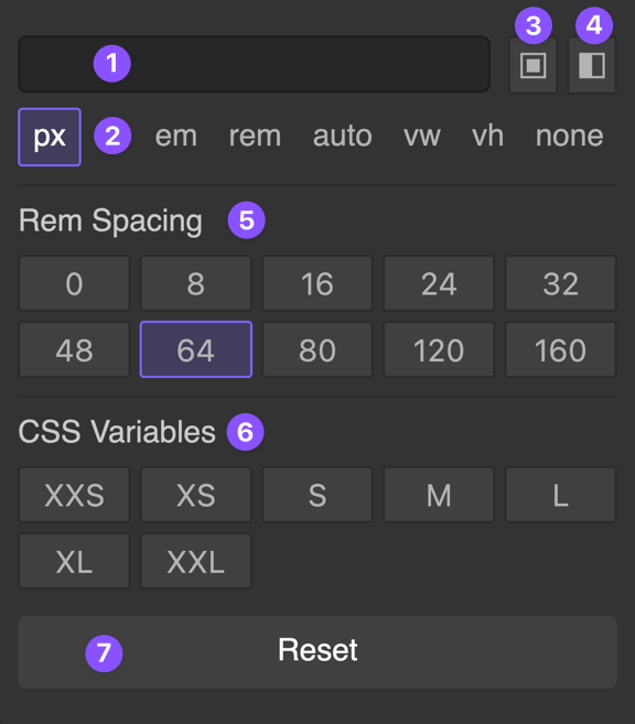
Options are:
- Input for typing scale
- Unit picker
- Apply all (shortcut:
ALT + CLICKon some of the predefined values) - Apply the opposite (shortcut:
SHIFT + CLICKon some of the predefined values) - Rem spacing scale (work in px, output in rem)
- CSS Variables shorthand
- Reset value (
+SHIFT- reset opposite,+ALT- reset all)
1.2 Indications
When you click on some of these options, a popup panel with adjustment options will be shown and look like this in the picture below:
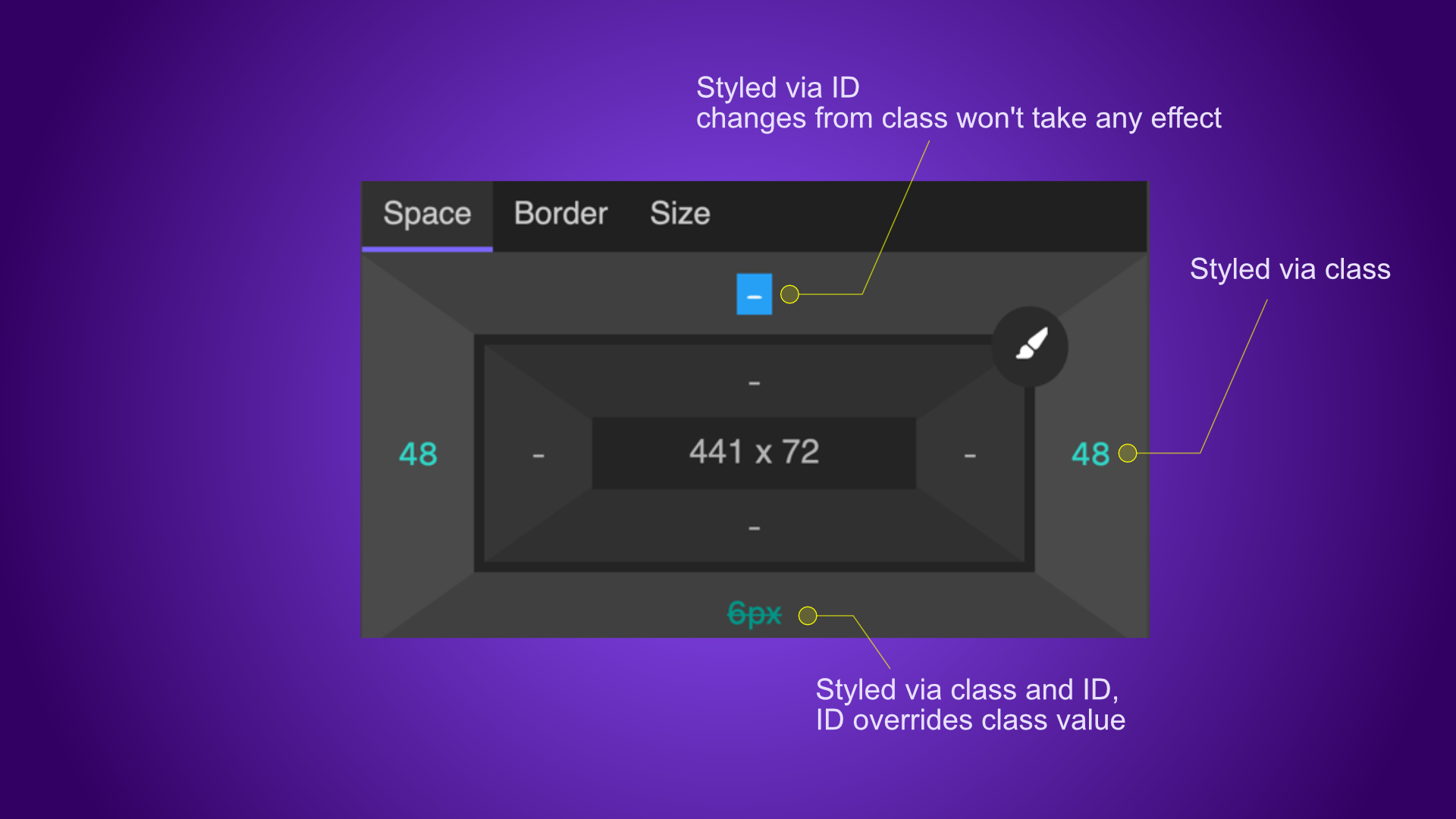
The box model will indicate if the element is styled via ID or class.
If the element is styled via ID and the class does not have styles on that option, it will show a blue box and indicate that anything that you change won't take effect for that option.
If you are editing a class and the element is also styled via ID it will strikethrough value which is overridden by ID.
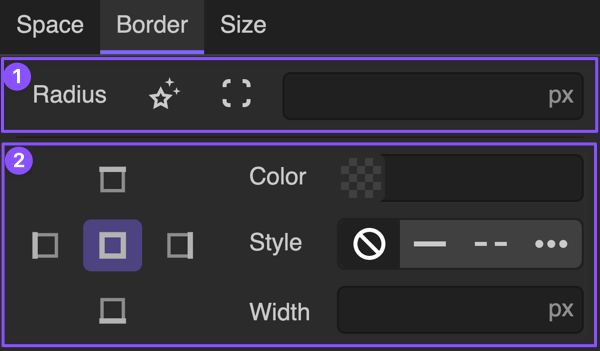
2. Border panel
Border panel consists of two groups:
- Radius (corner) controls
- Border controls (color, style, width)
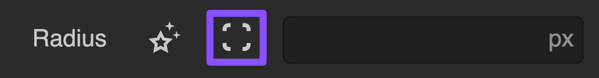
2.1 Radius controls
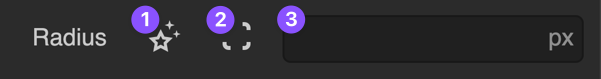
Border radius controls have 3 options like labeled in the picture below:
- Advanced radius controls
- Individual corner radius
- All corner radius
2.1.1 Advanced Radius controls
Here we have another three options:
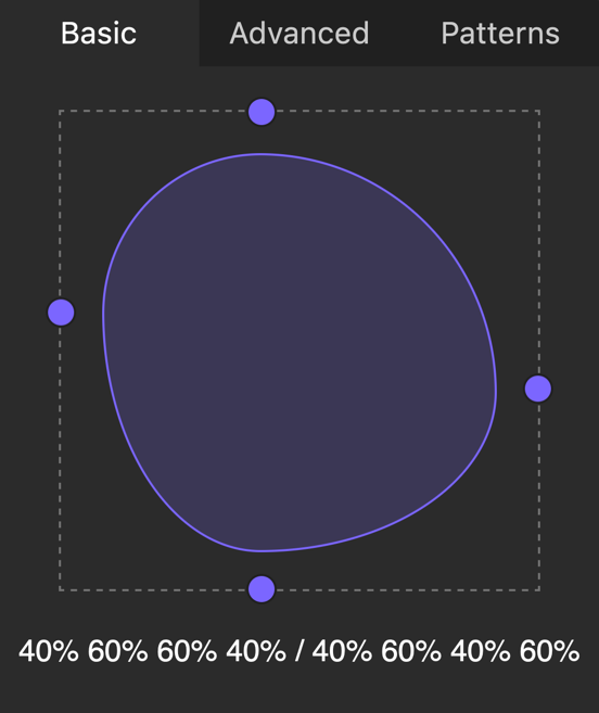
1) Basic edits will help you turn your element into a blob
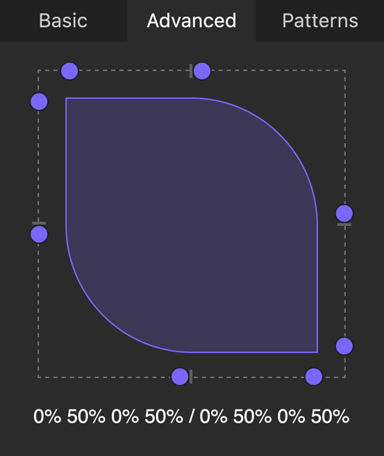
2) Advanced edits will give you full control over the border-radius, so you can nail it. If you go too crazy, to reset to default you can just click on the shape and start tweaking the radius again.
3) Patterns hold predefined radius styles
2.1.2 Edit individual radius
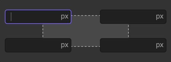
Click on this icon and a popup with individual corner radius controls will open:
After clicking you should see a popup panel like this with controls for each corner (top-left, top-right, bottom-left, bottom-right):
2.2 Border controls
Border controls consist of two groups of controls:
- Border to edit (all, top, right, bottom, left)
- Selected border options (color, style, width)
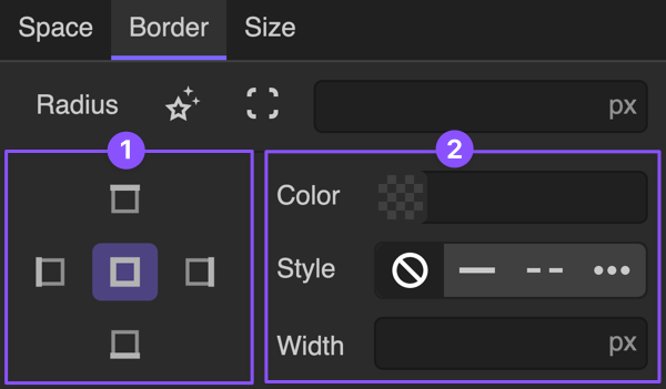
To edit borders you will need to select desired border from the left option group (all, top, right, bottom, or left) and pick a color, select style and specify width.
2.3 Indications
The indication system is made to provide rich and logical hints about styles.
If something is styled via class it will have a green label, and if it is styled via ID label will be blue.
If value is present there will be a dot before the label and by clicking on the dot you will reset only that value.
If value is coming from the upper breakpoint you will see underlined label so you can know that you need to go to upper breakpoint to adjust the value.
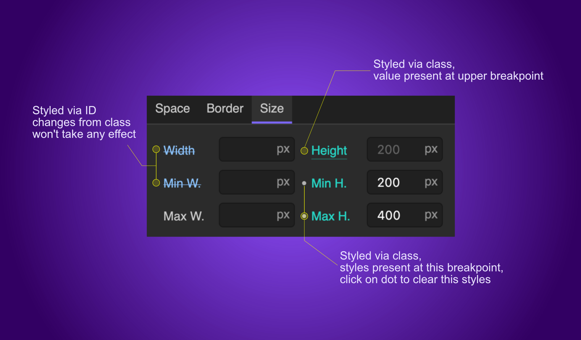
In the image below we could see various types of indications, let's see could we identify them:
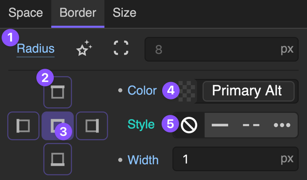
In the image above we have various types of indications like:
- Radius edit coming from an upper breakpoint (underline), and it is styled via ID (blue label)
- Present styles of borders (top, right, bottom, left), outlined buttons
- Active editing for the option all borders, filled button
- Color styled via ID (blue label), dot before label indicates that the value is coming from the current breakpoint, to clear that option to hover on the dot and you will see a red X icon
- Style coming from class (green label)
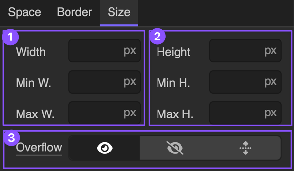
3. Size panel
Size panel consists of three groups:
- Width control group (Width, Min Width, Max Width)
- Height control group (Height, Min Height, Max Height)
- Overflow control group (Visible, Hidden, Scroll)
3.1 Understanding Width and Height Controls
The first two groups controls are Width and Height, and they work with the same logic.
Priority:
- Min Width
beats both Width and Max Width(element will never be smaller than this) - Max Width
beats Width - Width sets desired element width (avoid hardcoding this much as you can, commonly used value is 100%)
The same priority logic applies to Min Height, Max Height, and Height.
3.2 Overflow controls
If we set fixed width or height of our box, the content inside of it often won't be able to fit within constraints so we should set how content should behave in these conditions.
Options are:
- Visible - Content is not clipped and may be rendered outside the box.
- Hidden - Content is clipped if necessary to fit the box. No scrollbars are provided.
- Scroll - Content is clipped if necessary to fit the box. Browsers always display scrollbars whether or not any content is clipped.
- Auto - Content is clipped if necessary to fit the box. Browsers will display scrollbars only if any content is clipped.
3.2 Indications
In the image below we can see some examples of the indications which will this panel provide to you so you could have a better understanding of what is going on with element style.
Example shows editing class with an indication of the width styles which are coming from ID and therefore could not be overridden by a class. Height is styled via class, but we can see underlining which tells us that styles are coming from some upper breakpoint.
Min and Max Height are values coming from the class and the dot before each label tells us that value is present at this breakpoint. To clear individual values from this breakpoint, we could just click on the dot and values will be cleared.